InterVarsity MPD Companion
Client Overview
MPD (Ministry Partnership Development) is modeled in scripture and is a relational process that invites others to join what God is doing on campus. New staff receive training and coaching through the MPD Department and often do MPD in community with others. The MPD Department is committed to supporting InterVarsity staff as they work towards building these relations and increasing funding for their personal ministry budget.
Objective
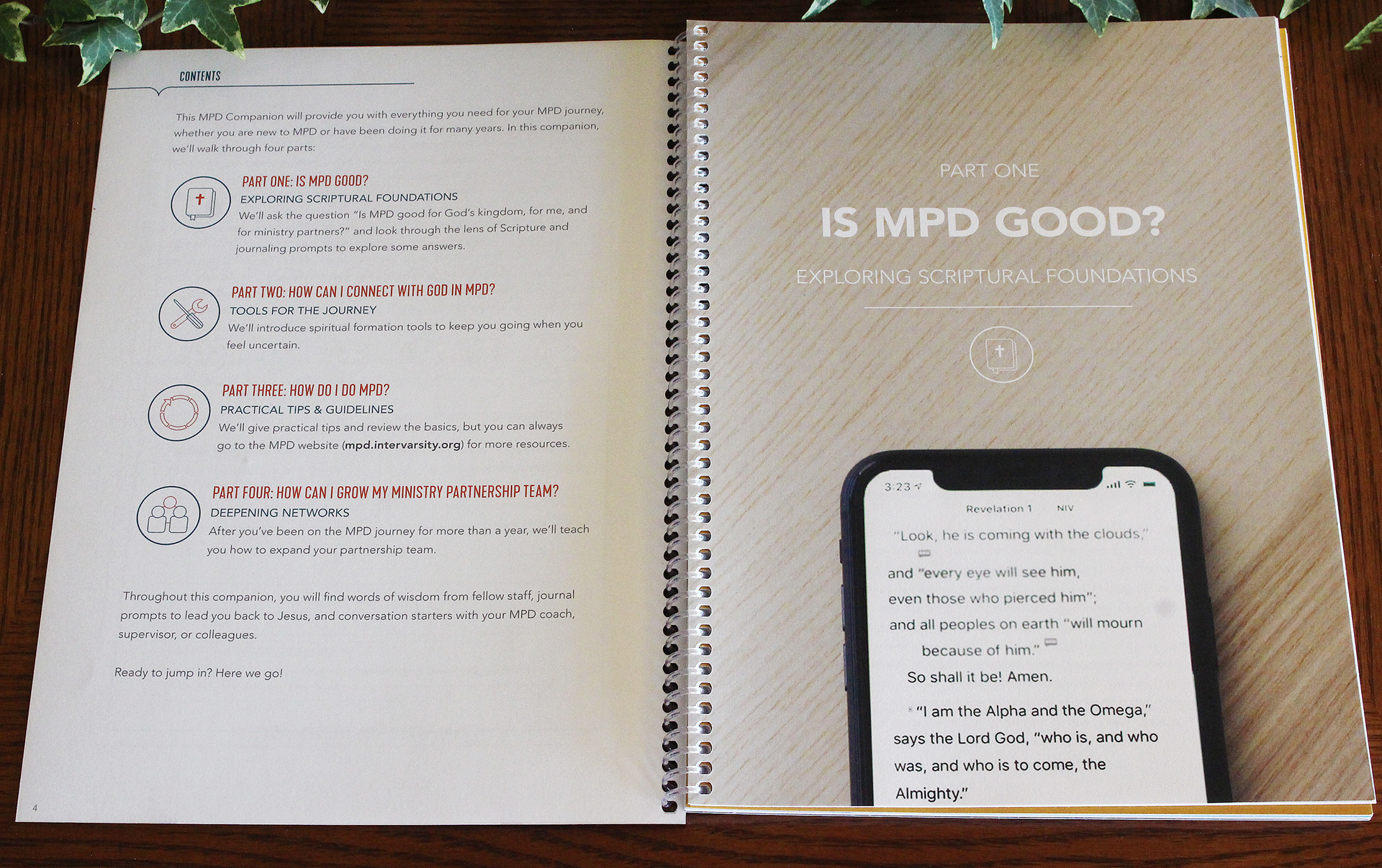
The MPD Department requested an update to the previous MPD manual. This version focuses on the spiritual foundation and formation of MPD, followed by some practical tools. Practical training will still be mostly found on the MPD website, so the point of this piece is more about helping staff work through their spiritual development and emotions around MPD. The design task is to modernize the content layout to better represent InterVarsity’s new brand book. The intended outcome is that through this manual, staff will feel encouraged and equipped to do MPD, be led closer to Jesus, and allow for dialogue with their supervisor, coach, and/or team. Ultimately, the desire is for staff to have the tools to get fully funded!
Design Solution
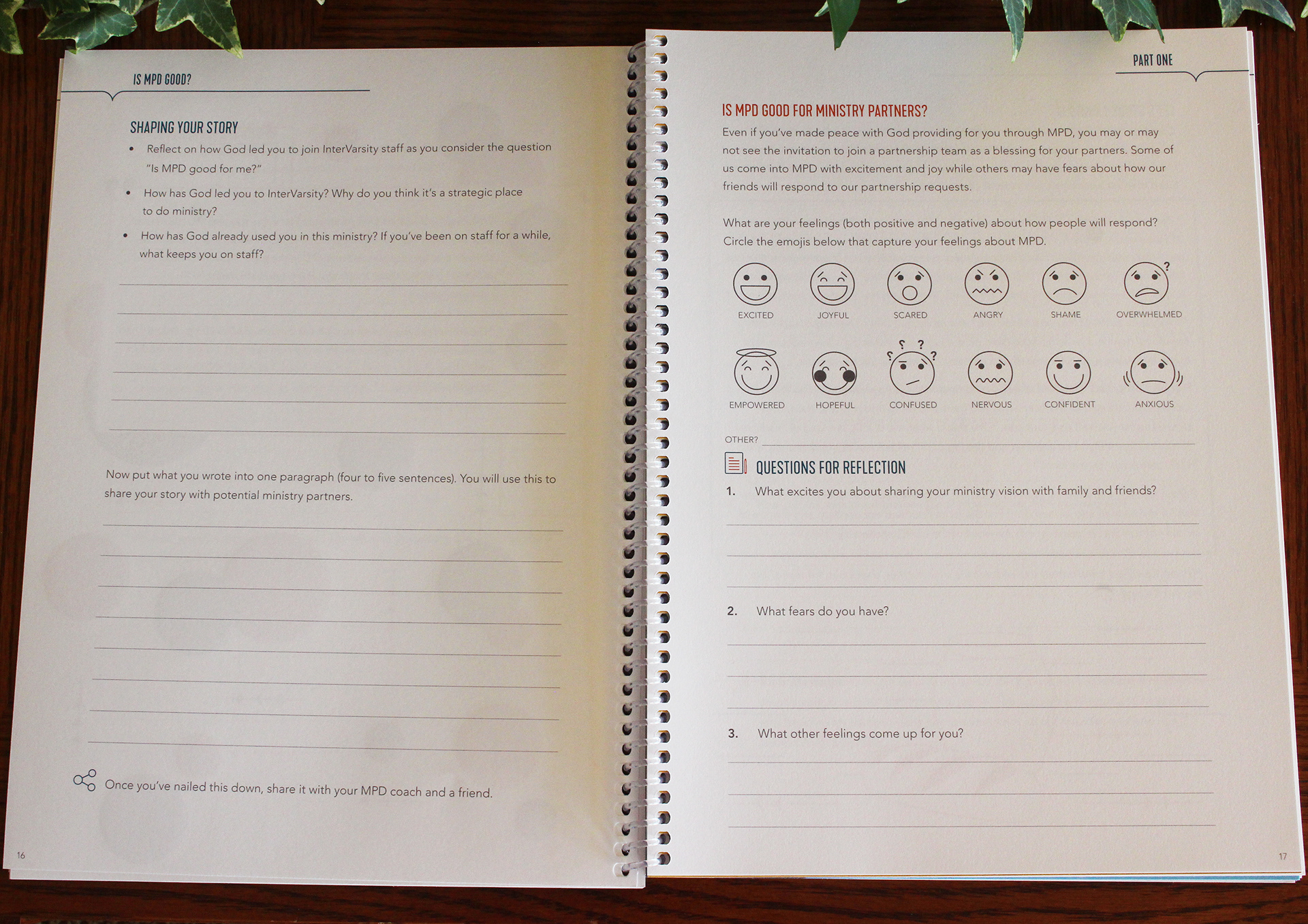
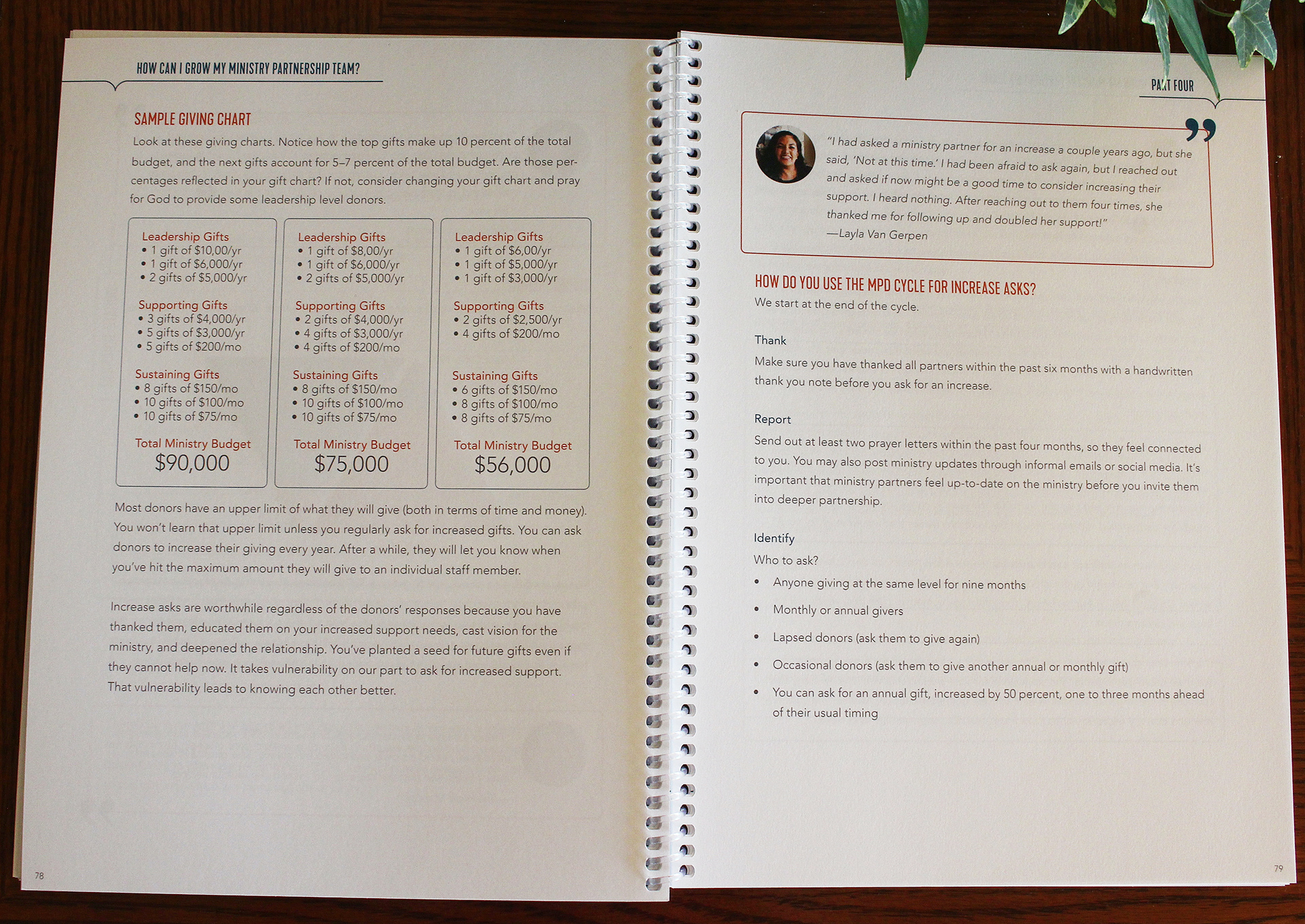
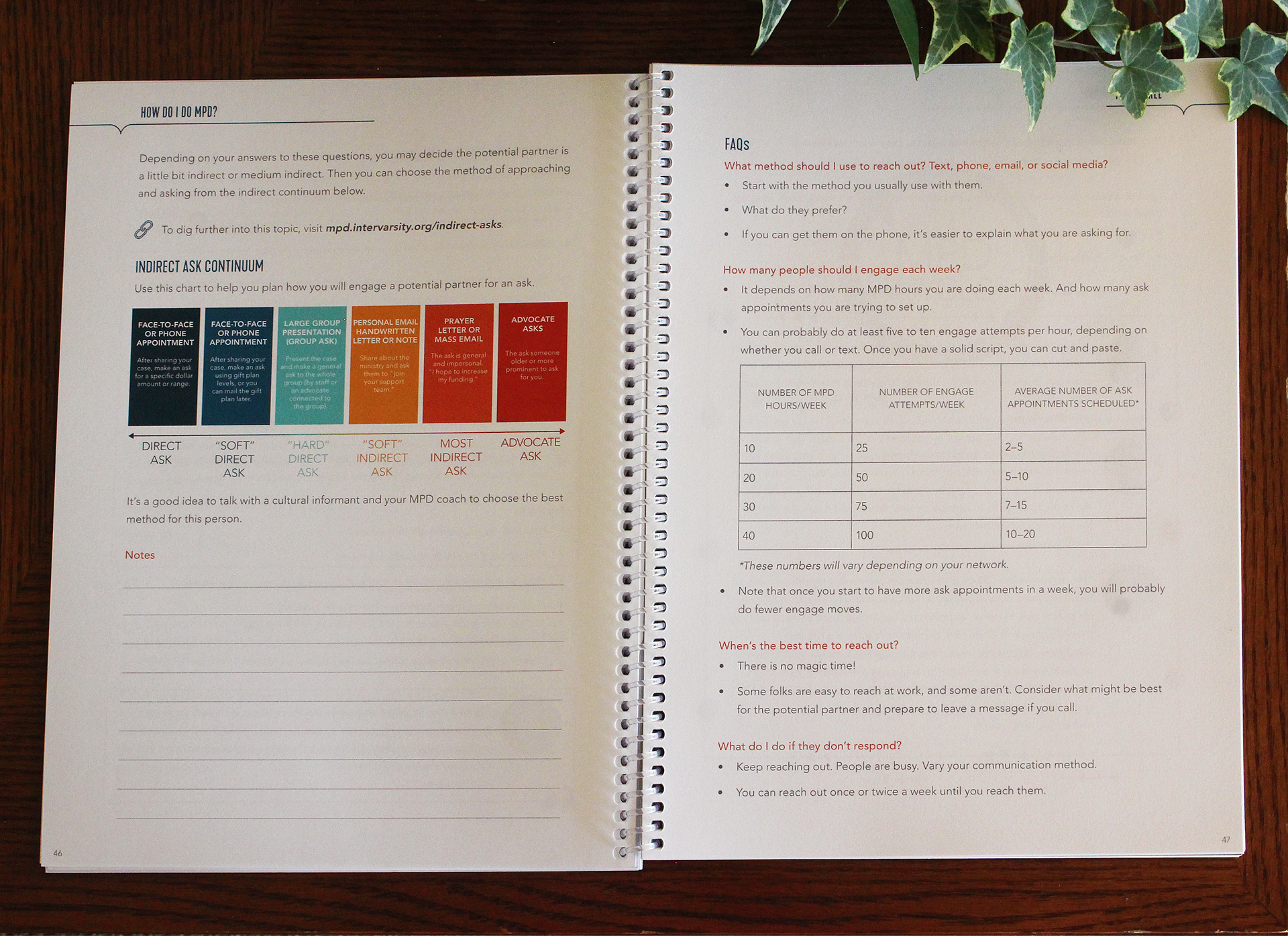
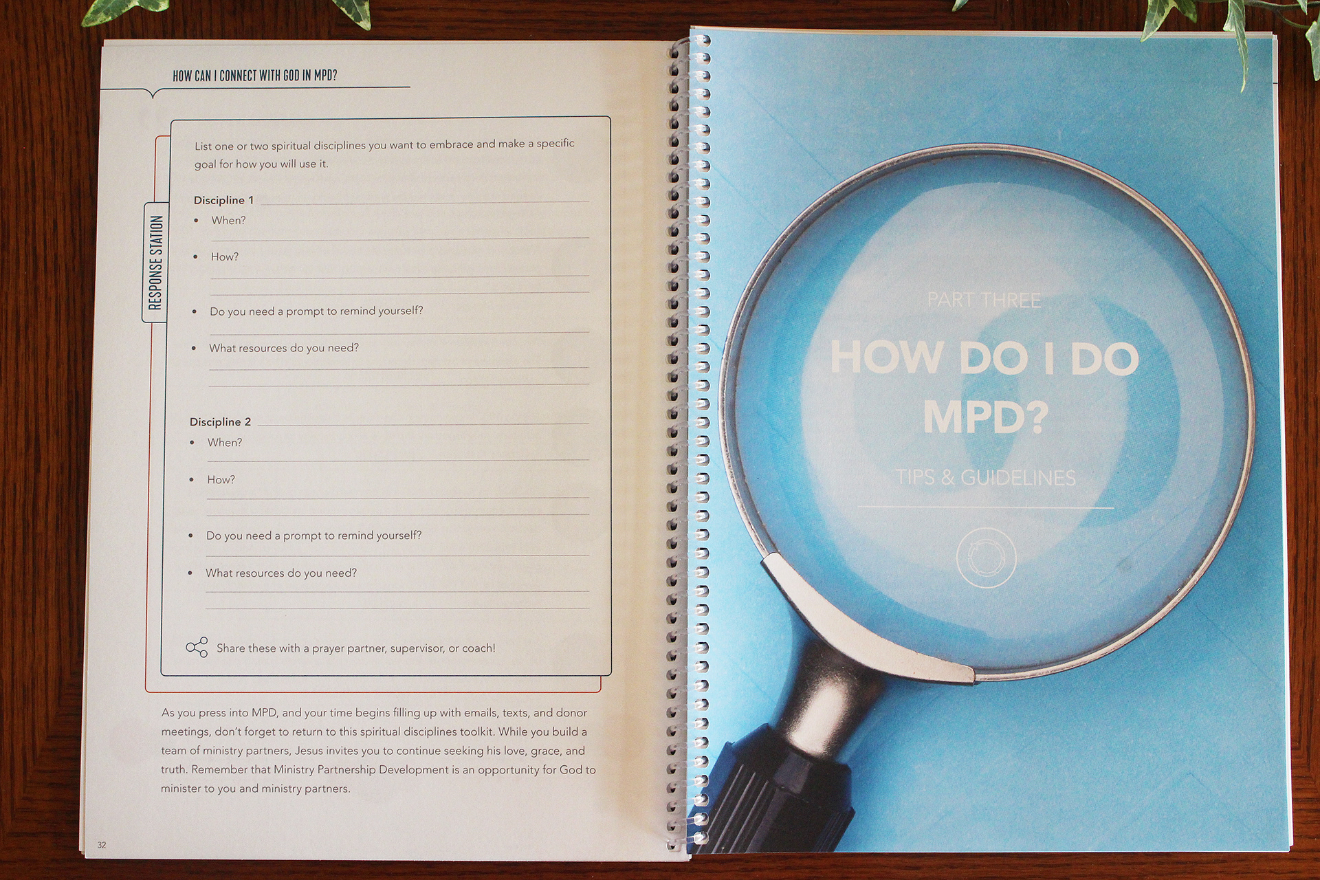
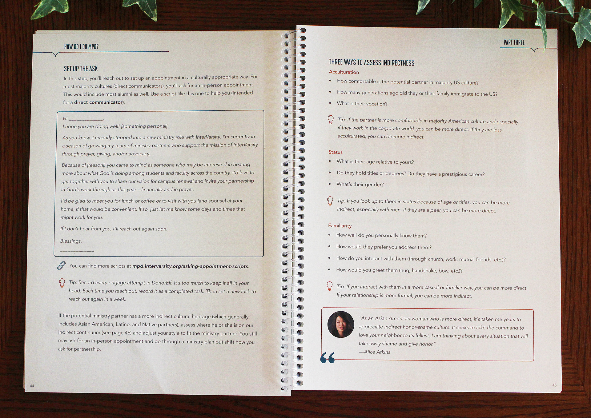
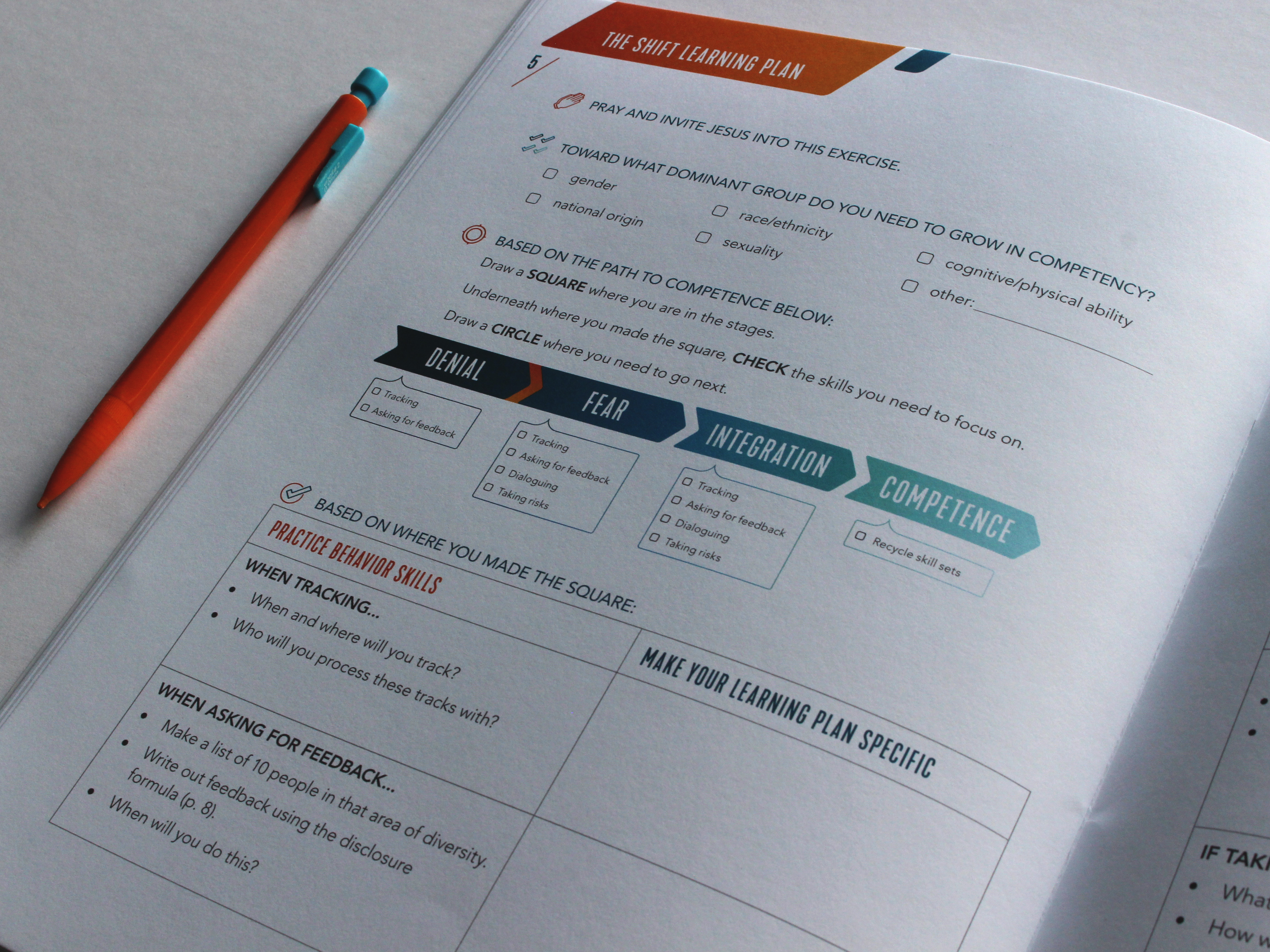
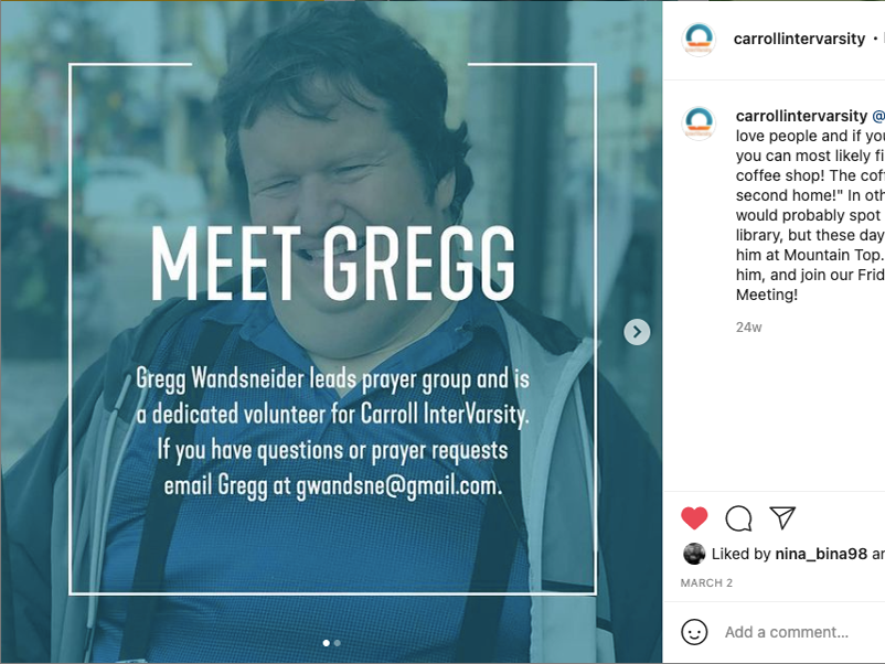
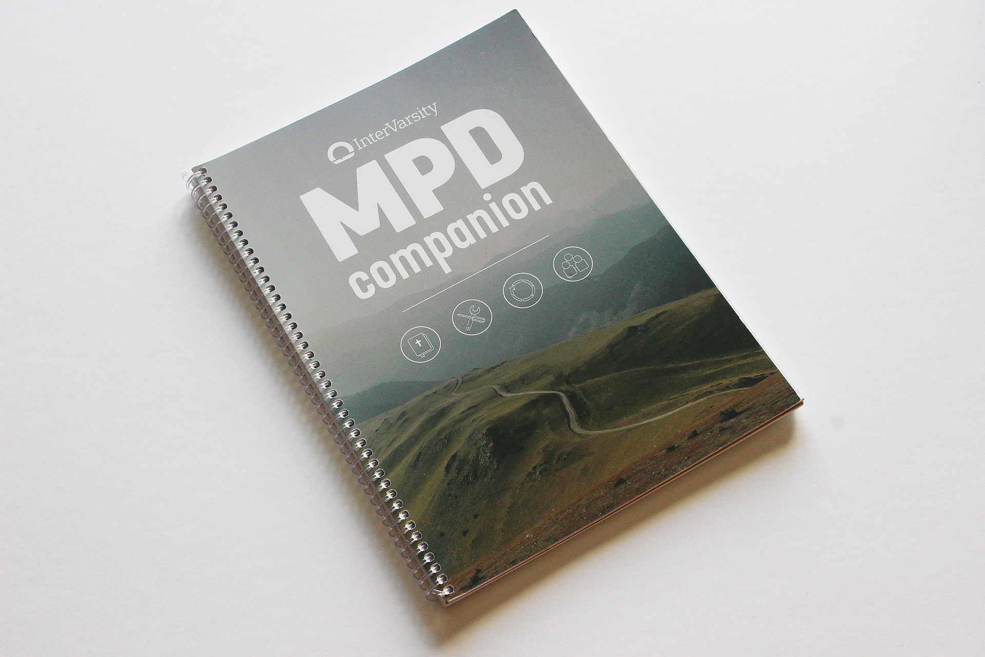
As I began this project, I received a large document of text to format from the editorial team. Since the manual was to be very content-heavy, I planned to create a layout that would guide the reader from section to section, header to header, subheader to subheader, etc. The design of the header on each page is consistent with the design elements of the speech bubble prominently seen in the brand of InterVarsity and contains the title of the section that the reader is currently in. For the body copy, I relied on the primary brand colors of InterVarsity, Revival Orange and Missional Blue, to emphasize headers and subheaders; alternating the colors as the text descended in the hierarchy. Another way that I sectioned the text was through the use of repetitive and familiar icons which alerted the reader about the content to follow, such as a lightbulb icon next to every tip. In addition, all templates, quotes, and bible passages are sectioned off from the main body of the text, creating divisions and emphasis between the differing materials. Since MPD is a continual journey throughout a staff members’ ministry and involves many other people, I focused on conveying direction, movement, connection, and community throughout my design. To emphasize the importance of community, increase personability, and lighten up the load of the text, I devised the idea of pairing each person’s quote with their picture. I continued this idea by designing vector graphics (circles, lines, and triangles) as additional fun elements. The circles represent community, while the lines and triangles convey movement and direction. Every couple pages there is a “Response Station” which invites interaction as the reader writes responses to reflection questions and circles emoticons to express emotions.