DaVinci's Caffé D'Arté Menu
Client Overview
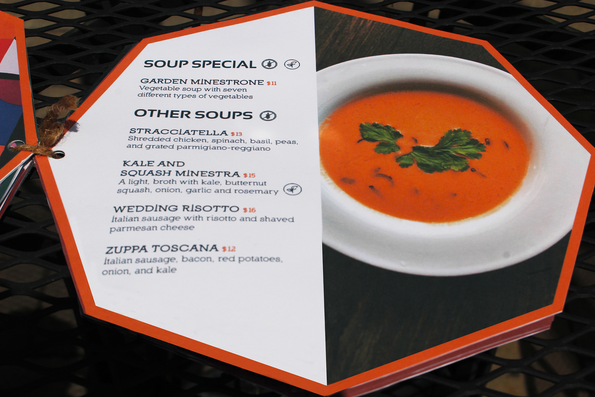
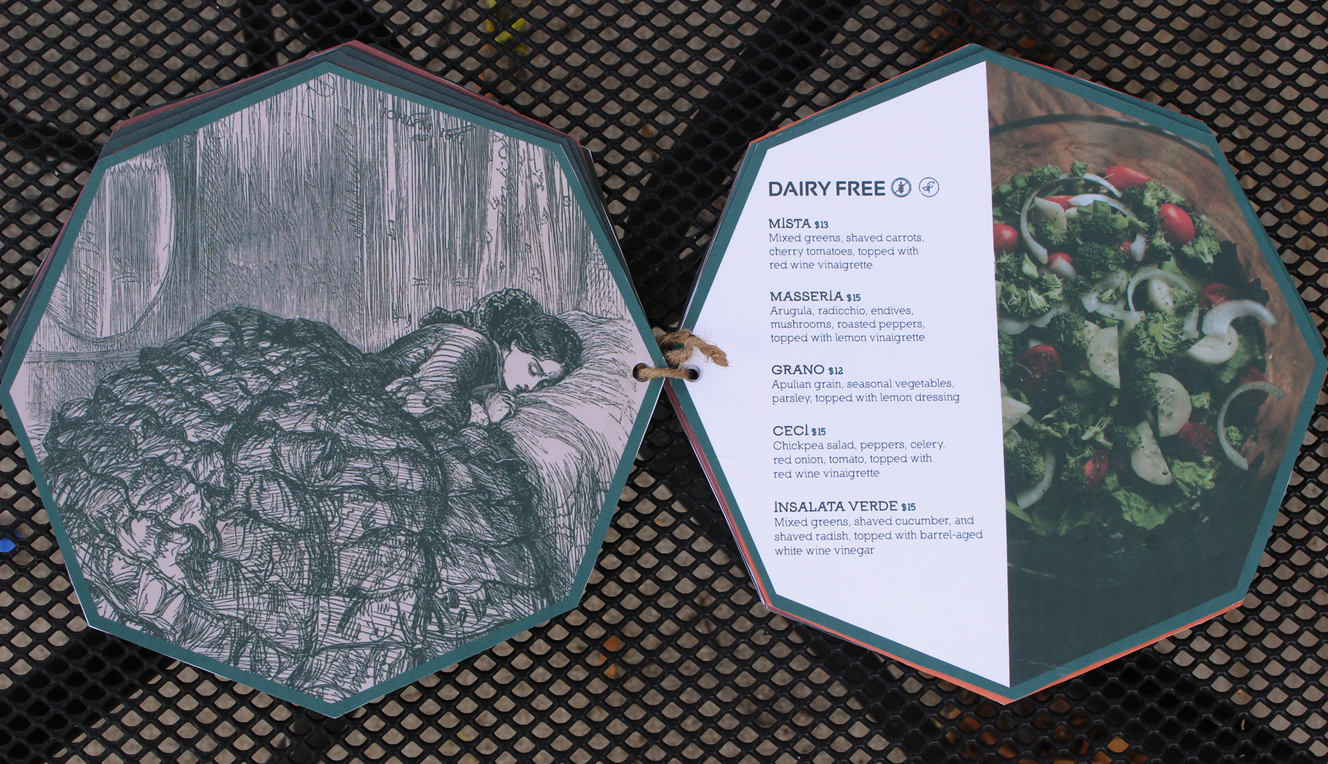
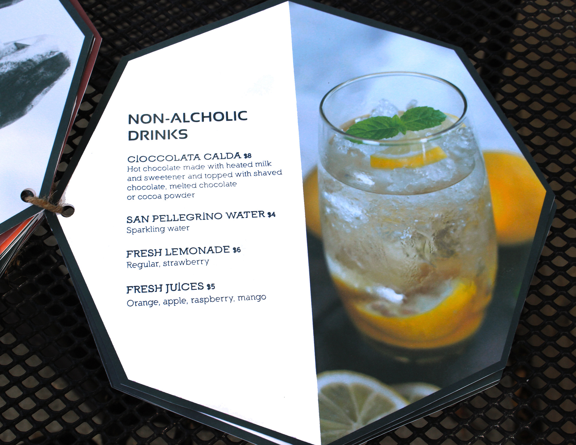
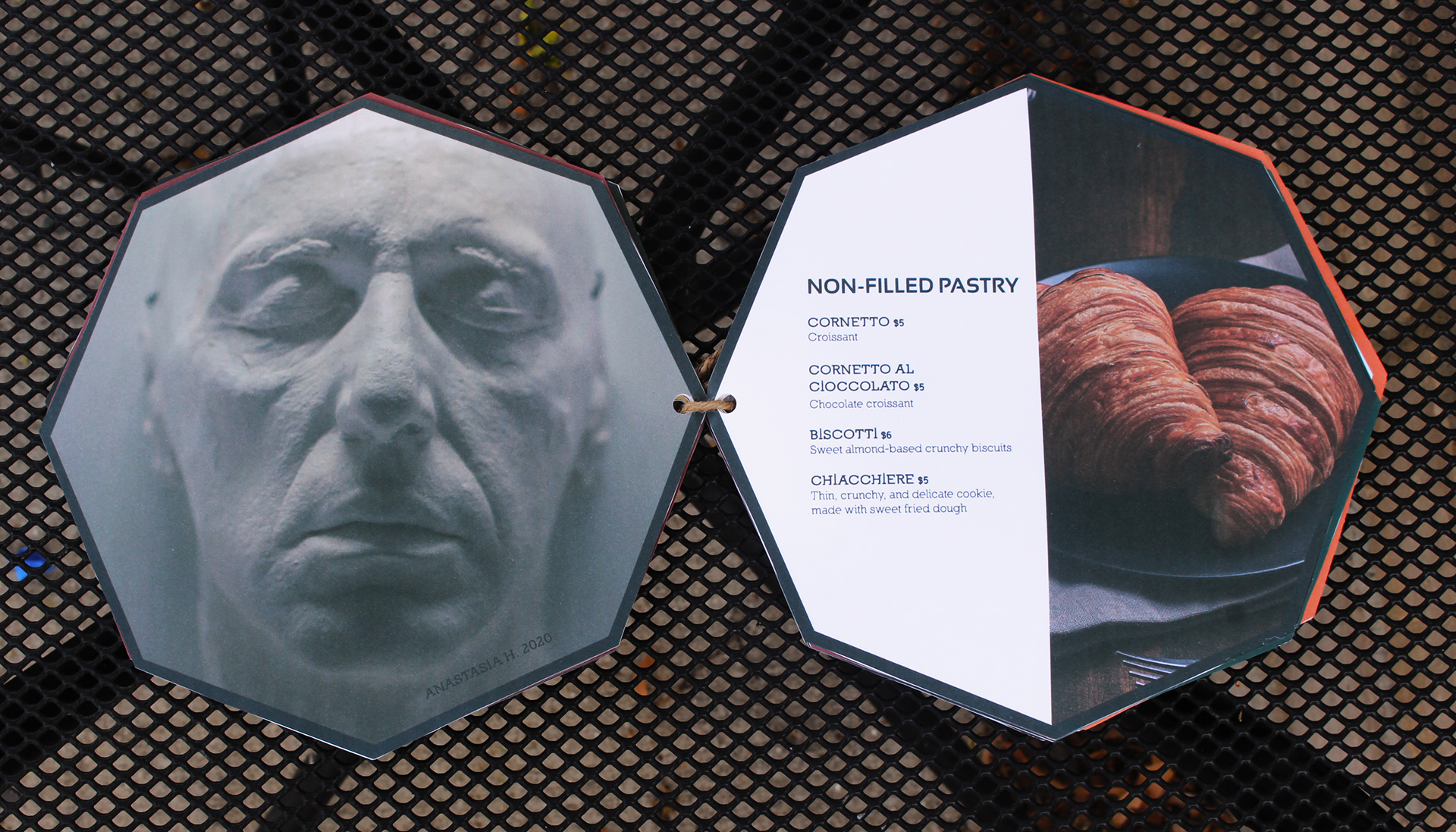
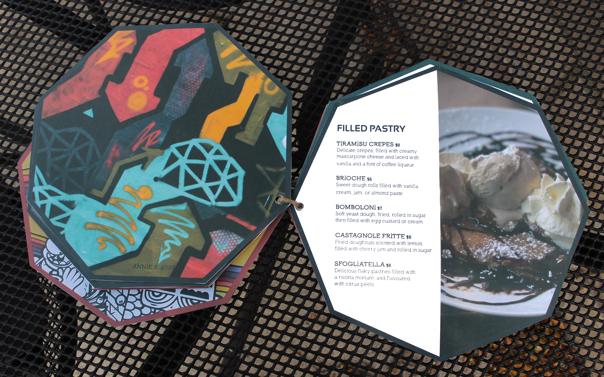
DaVinci’s Caffé D'Arté, located in New York City, is a fictitious, classy, high-end art caffé that serves Italian breakfast and lunch. This niche caffé accommodates allergies and specializes in crafting traditional delicacies. In addition, this fine art establishment brings an atmosphere of refined beauty through choices of artist decor and entertainment. The outdoor and indoor seating areas are filled with fine art pieces created by aspiring and prominent artists located all over the world. An indoor touchscreen wall allows for customers to add their own creative touch to the space and if desired, print their artwork for a small fee. This caffé, although formal, allows customers to enjoy traditional Italian cooking while viewing and experiencing art.
Objective
The design task was to conceptualize a restaurant and then design a logo and menu for the establishment.
Design Solution
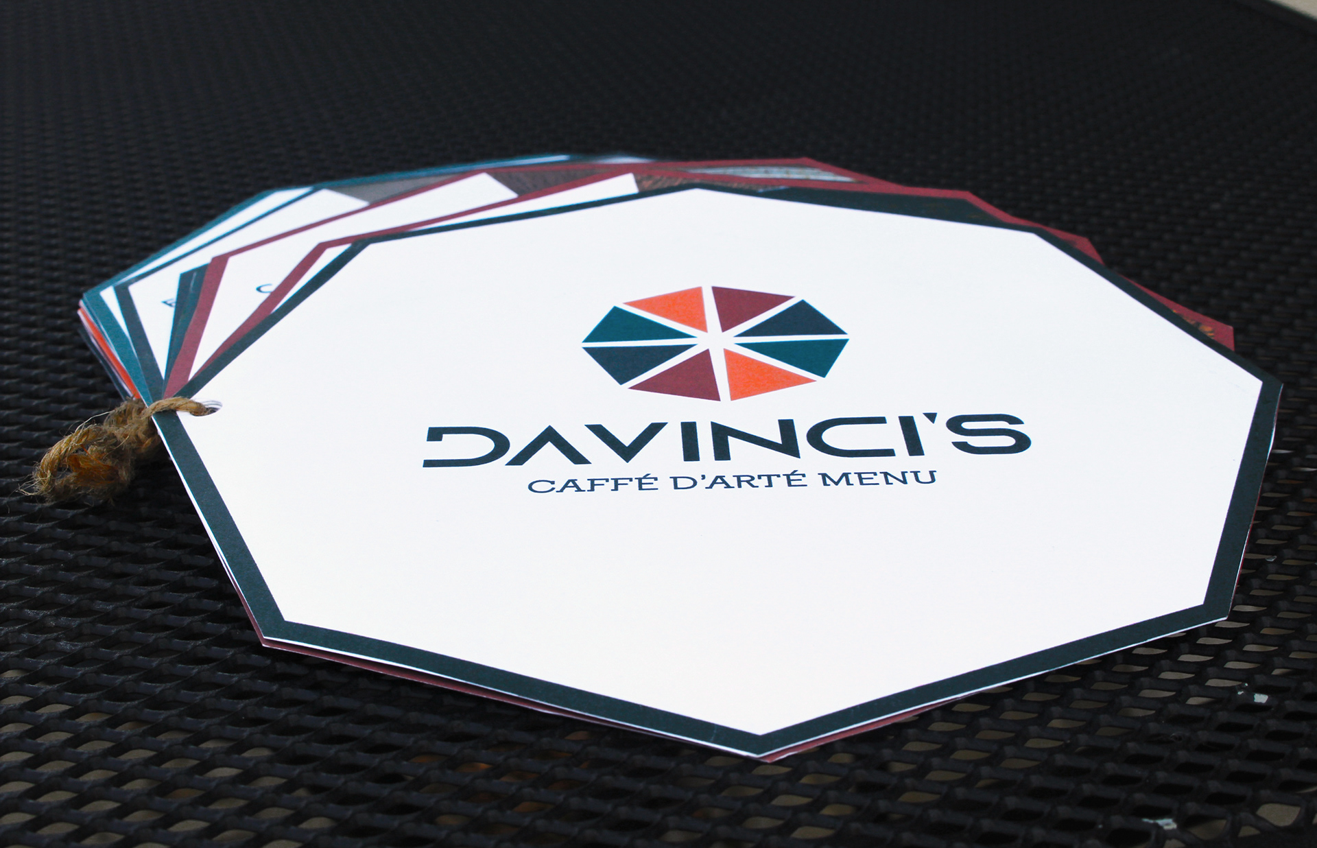
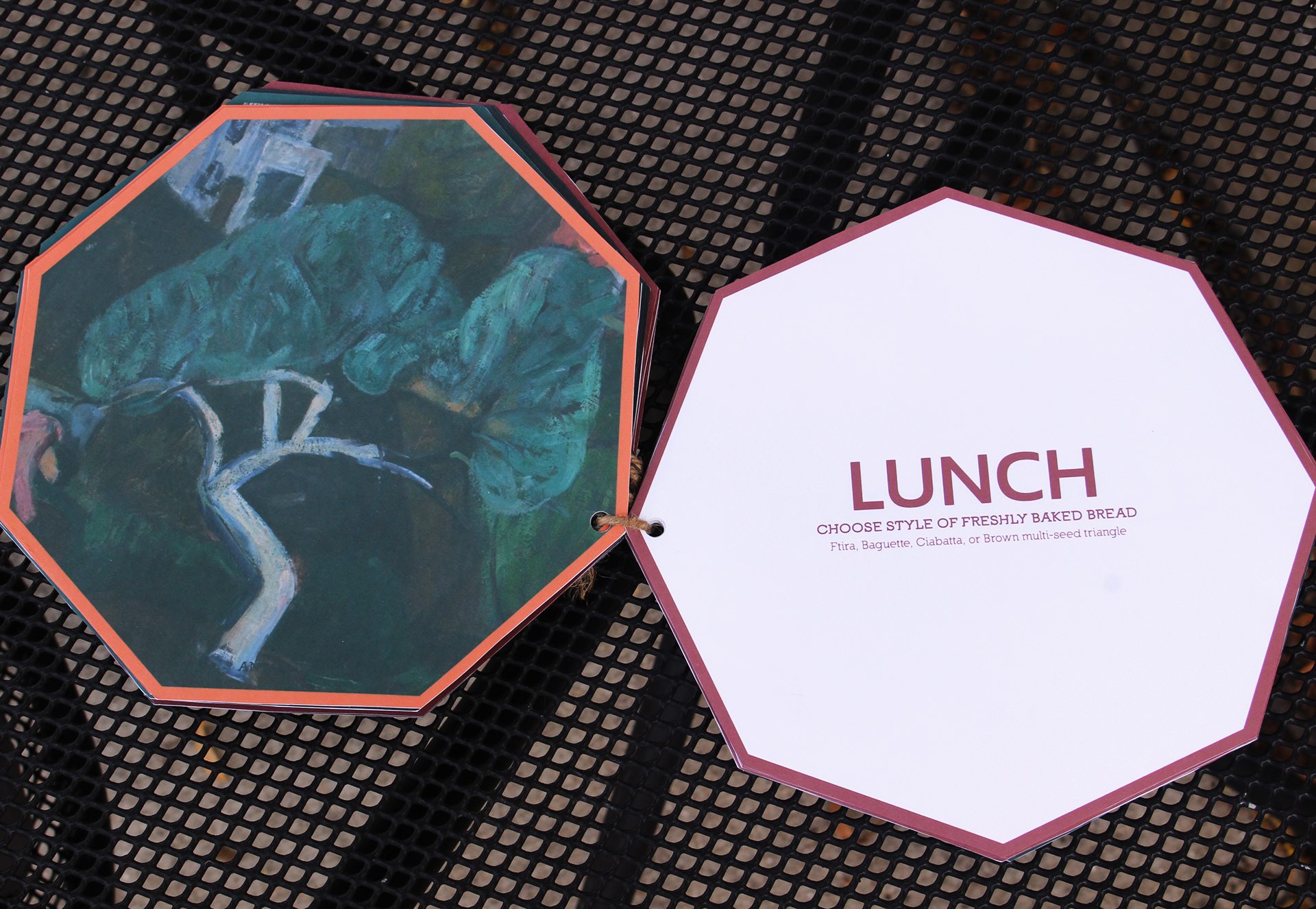
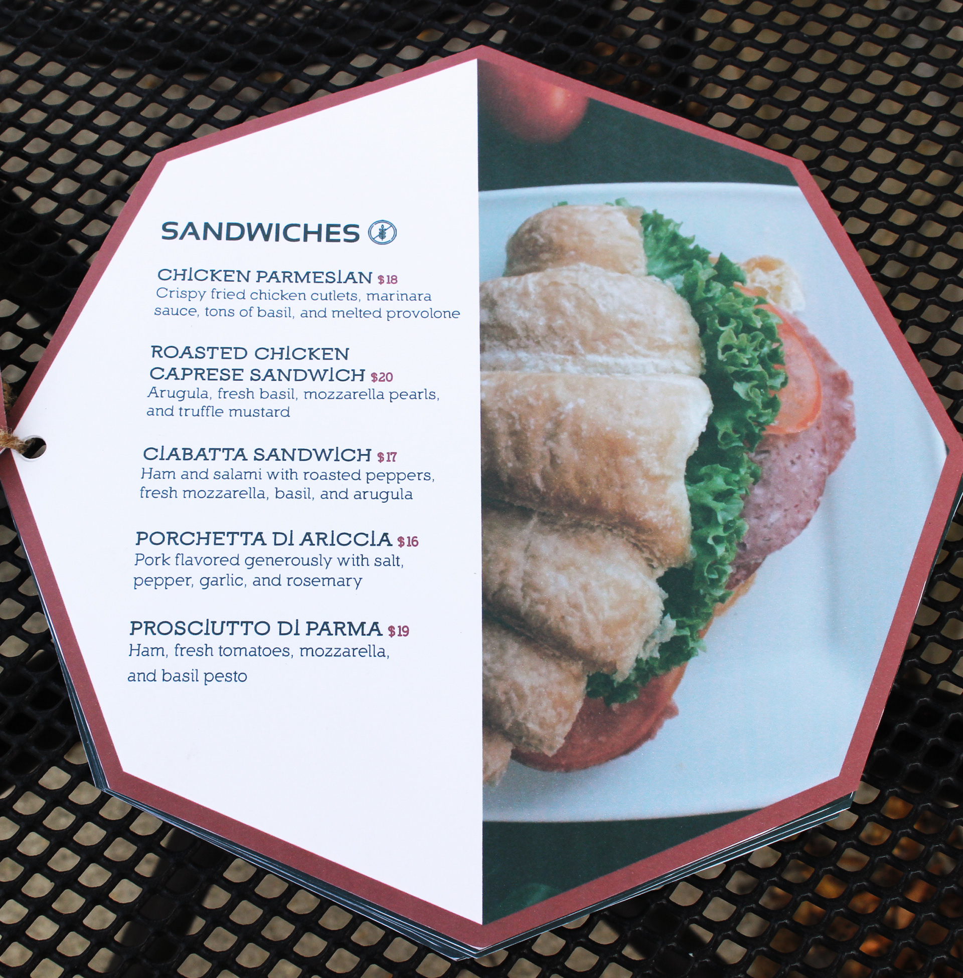
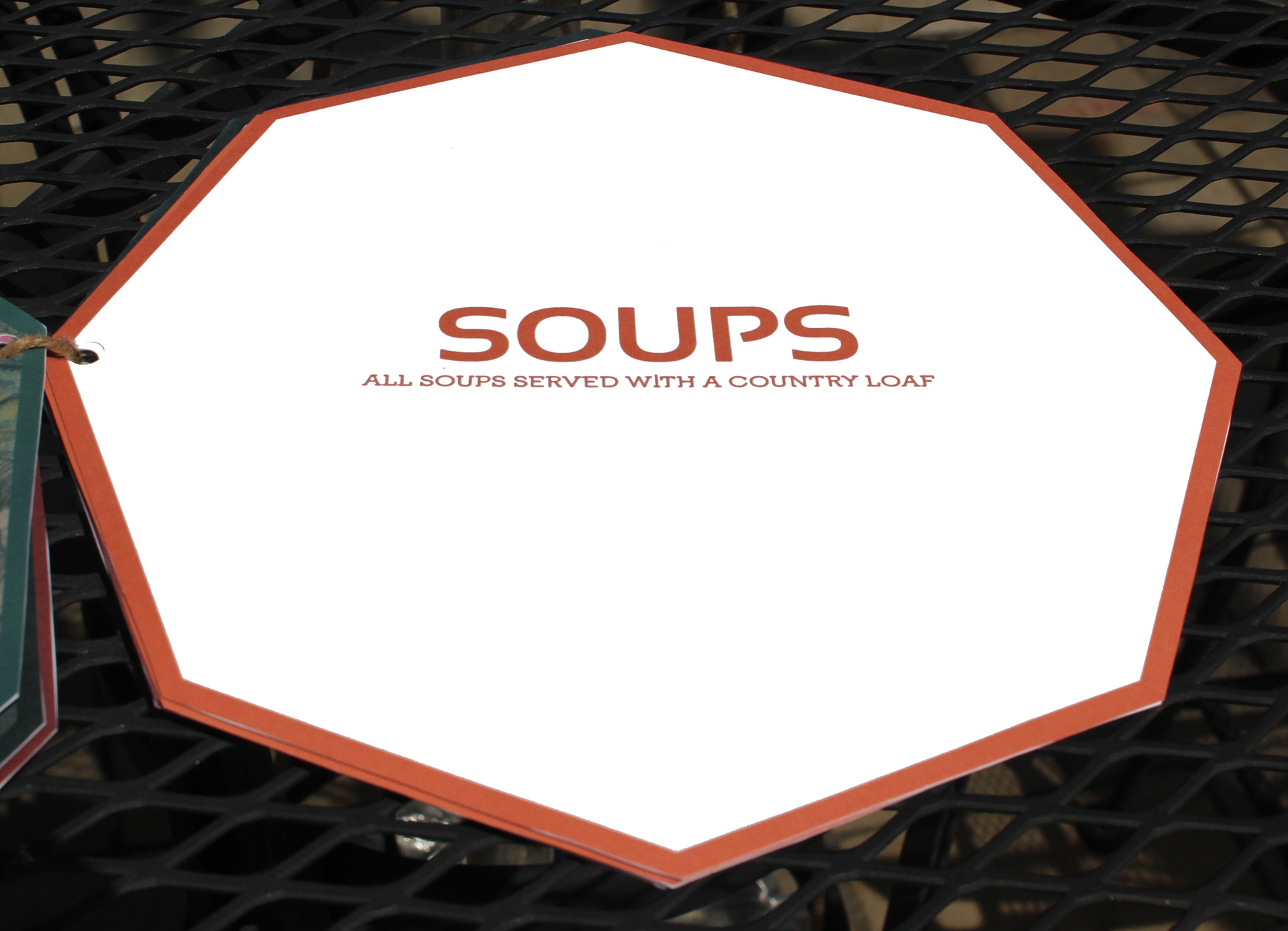
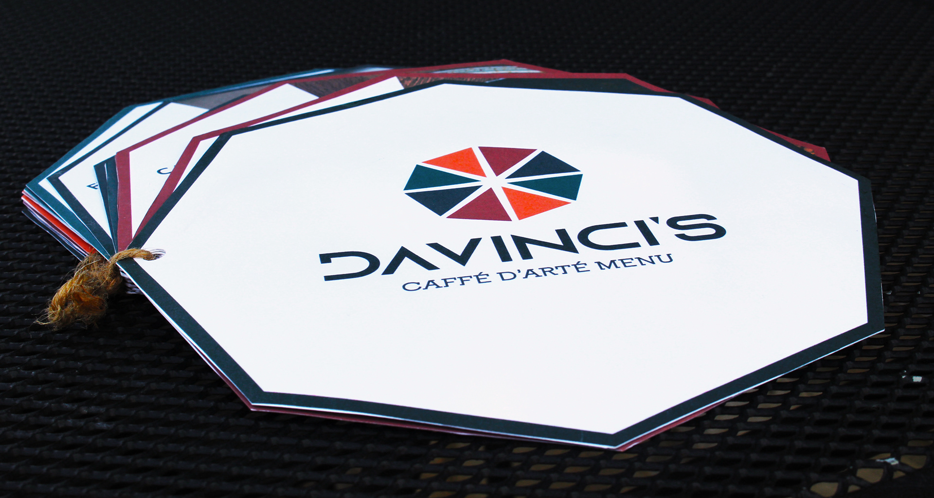
Since DaVinci’s is an art caffé I wanted to incorporate art itself and its means into the logo design. The octagonal shape of the logo is inspired by the symbol of creativity, a spider's web. The primary colors (with the exception of green) inside are representative of a painter’s palette. I continued this theme throughout the layout of the menu in its shape and color-coordinated sections. The typeface used for the logo is Azonix because the letter “A” had a certain abstractness to it. Although not all art is considered abstract art, all art indeed contains abstract concepts. Within the menu, I used Sansation Bold for all headers and subheaders. I chose this typeface, because of the similarity that it posed to Azonix. Although I wanted consistency between typefaces, I wanted the logo typeface to be distinct. In using Sansation, I was able to continue to convey this abstractness in a new way. The last typeface I used, for body copy, was the Nilland serif superfamily. This typeface was incorporated to accent the blocky sans of Sansation. Nilland Small Caps was used for Menu Items, Nilland Regular was used for the item descriptions, and Nilland Black was used at a smaller size to convey prices. Nilland and Sansation pair well together due to similar x-heights and abstractness in letterforms. The contrast of Nilland serif is still evident in the horizontal directionality that is portrayed in the serifs. The art on the reverse side of each menu section is credited to aspiring or prominent artists to broaden future clientele and boost name recognition.